Year
2024
Client
KINGSTON JUNIOR KNIGHTS
Category
Brand Identity Design
Product Duration
3 - 4 Weeks
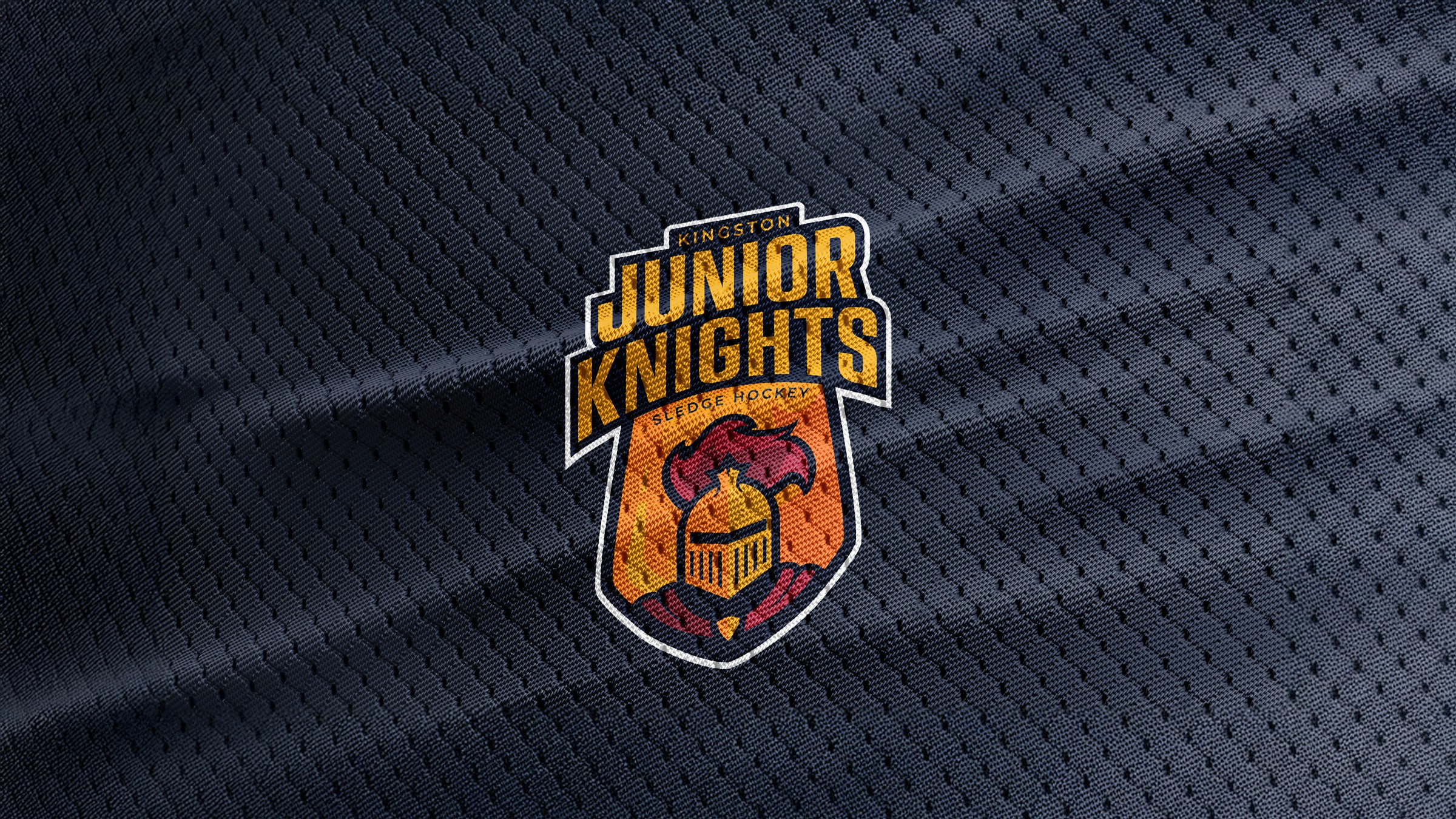
The logo for the Kingston Junior Knights Sledge Hockey Team was created with the goal of embodying strength, inclusivity, pride, and youthful energy, while aligning with traditional hockey aesthetics and local identity. Here's a breakdown of the design thinking behind it

The Kingston Junior Knights Sledge Hockey logo was designed to reflect strength, inclusivity, and pride. Centered around a knight’s helmet inside a shield, the logo symbolizes courage and unity—core values of the team. The bold typography conveys energy and confidence, while the curved “Sledge Hockey” element adds balance and clarity. A warm color palette of gold, red, and black evokes determination, passion, and resilience. Together, these elements create a bold, modern identity that connects with young athletes, celebrates their spirit, and ensures strong recognition across jerseys, merchandise, and digital platforms.