Year
2024
Client
NICOLE, GEOFF
Category
LOGO AND WEBSITE DESIGN
Product Duration
5 WEEKS
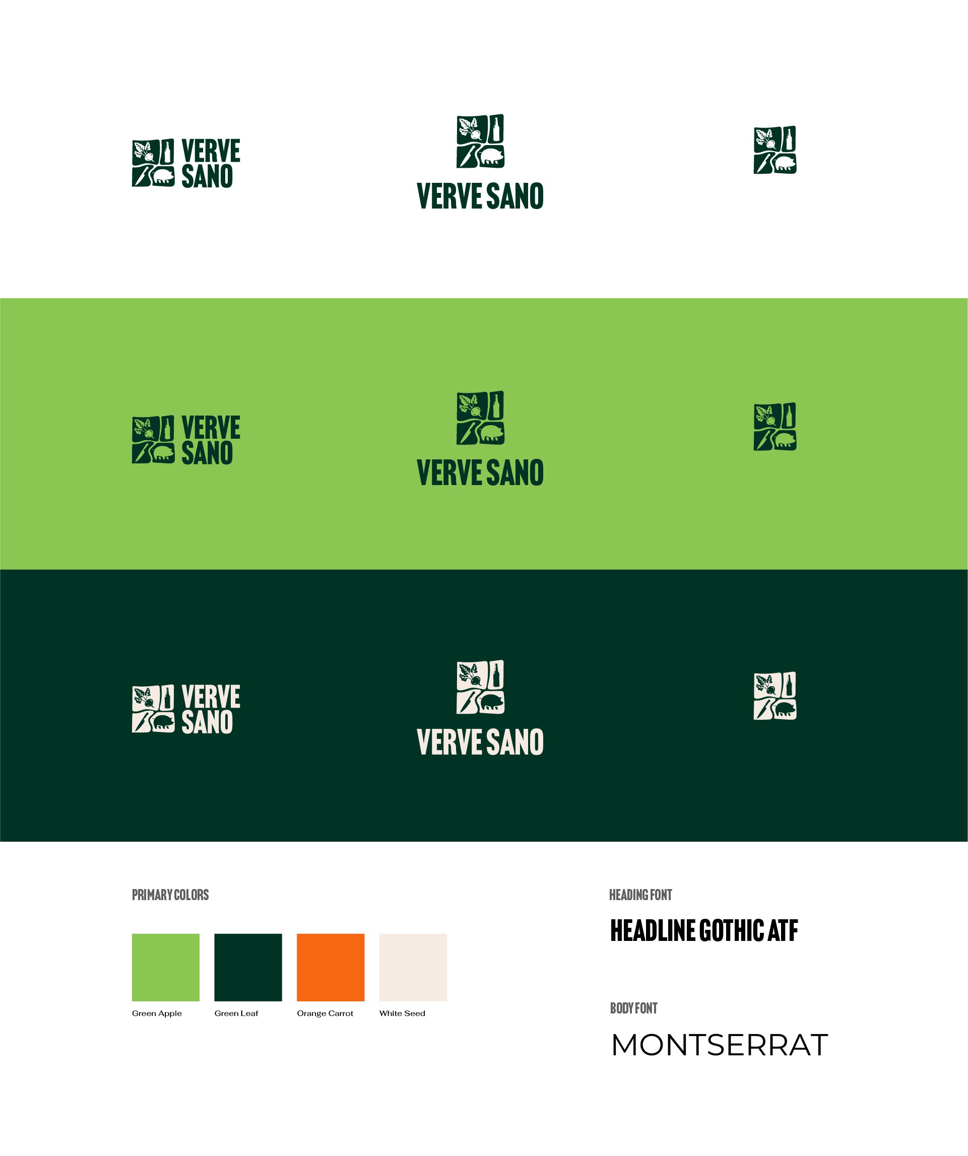
The Verve Sano logo was crafted to reflect the brand’s commitment to vitality, natural living, and functional nutrition. The name itself—“Verve” (energy) and “Sano” (health) guided the visual identity.
The logo features clean, geometric forms that convey stability, simplicity, and trust essential values in the health food space. The leaf and natural motif symbolize life, fermentation, and plant-based wellness, while the bold typography adds a sense of confidence and clarity, making the logo memorable across packaging, signage, and digital platforms.
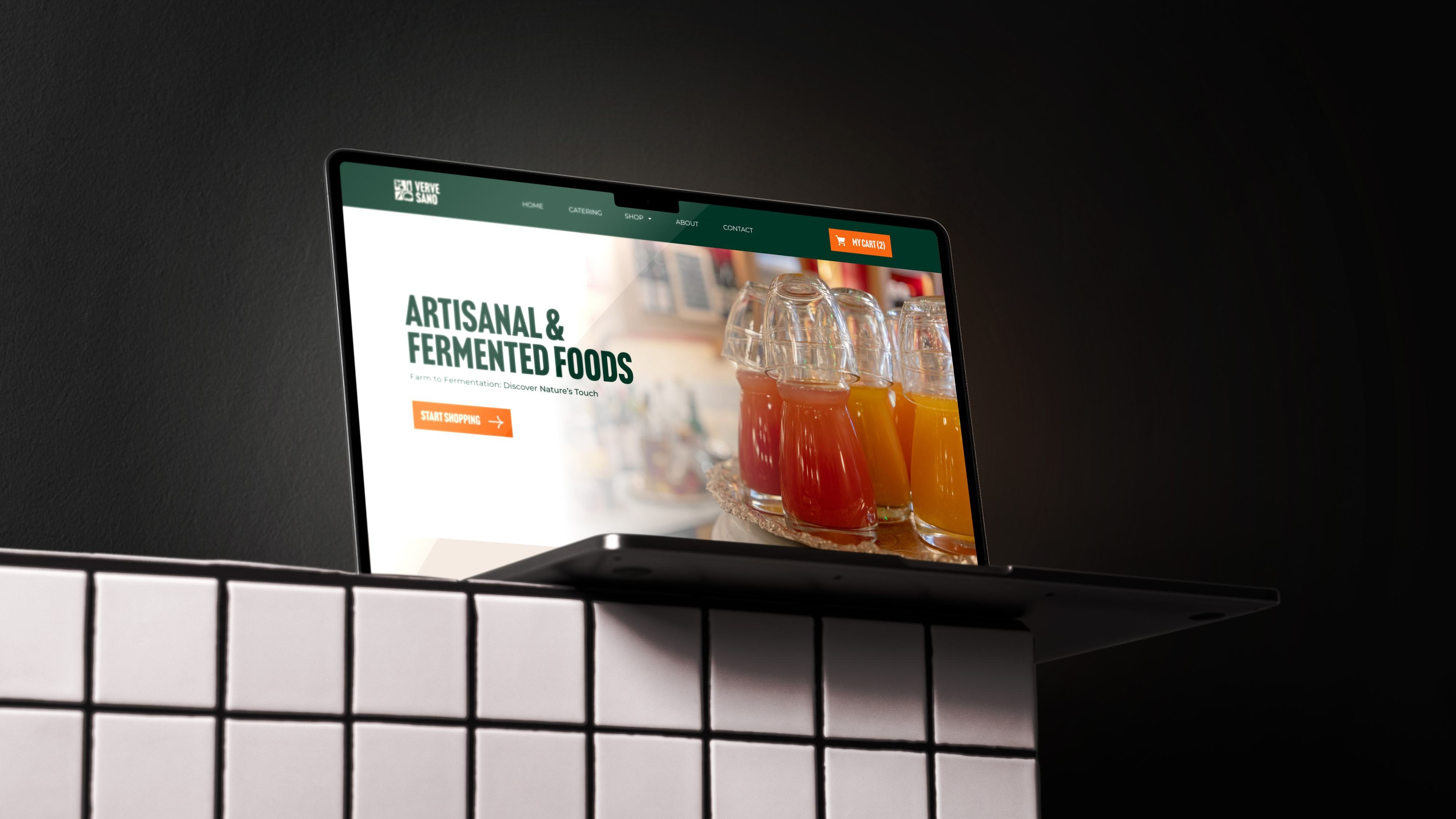
The website was designed with a focus on clean aesthetics, user-friendliness, and storytelling through visuals. The homepage instantly communicates the brand’s niche—artisanal and fermented foods—through high-quality imagery and concise messaging.
A dark green and orange color palette supports the natural, organic vibe while maintaining visual contrast and warmth.